Sunday, July 29, 2018

Making a map with clustered markers

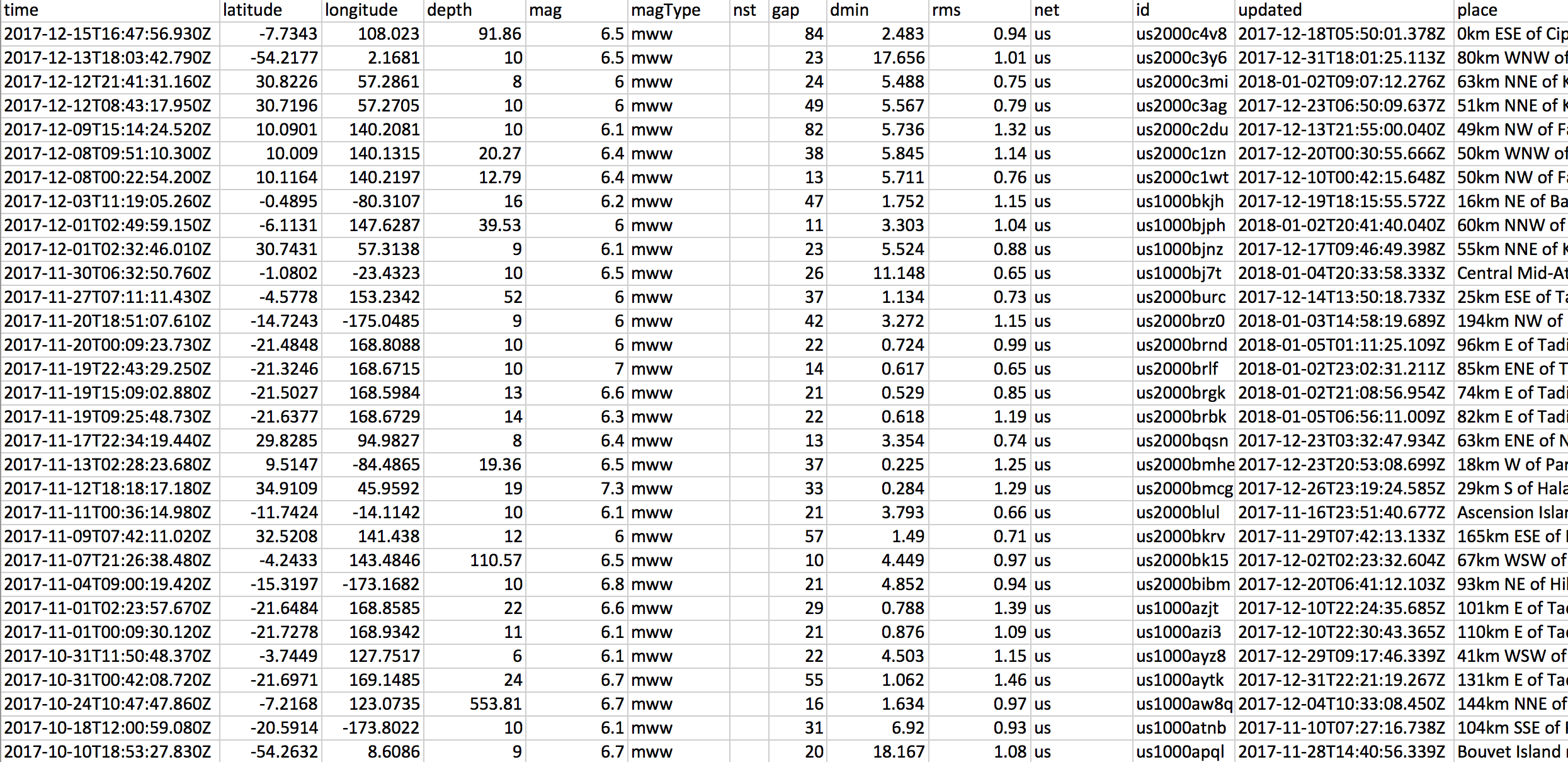
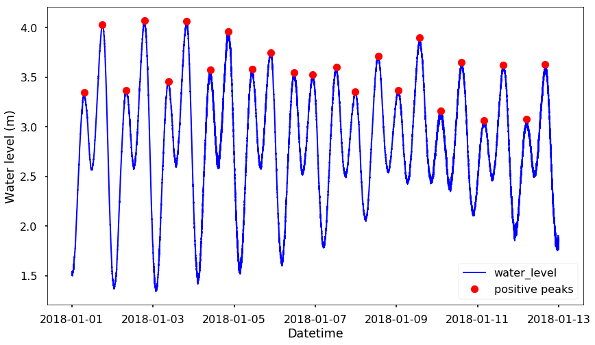
This week I was making a map with many points on the map - plot all the GPS stations from UNR's Nevada Geodetic Laboratory, they have a google map that can show all the GPS stations. See the following figure:
png
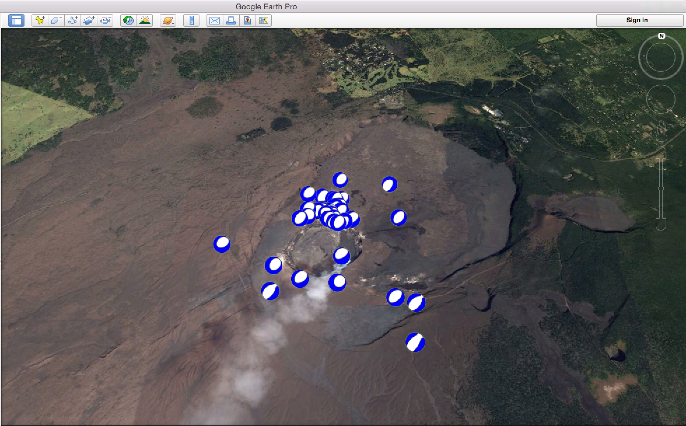
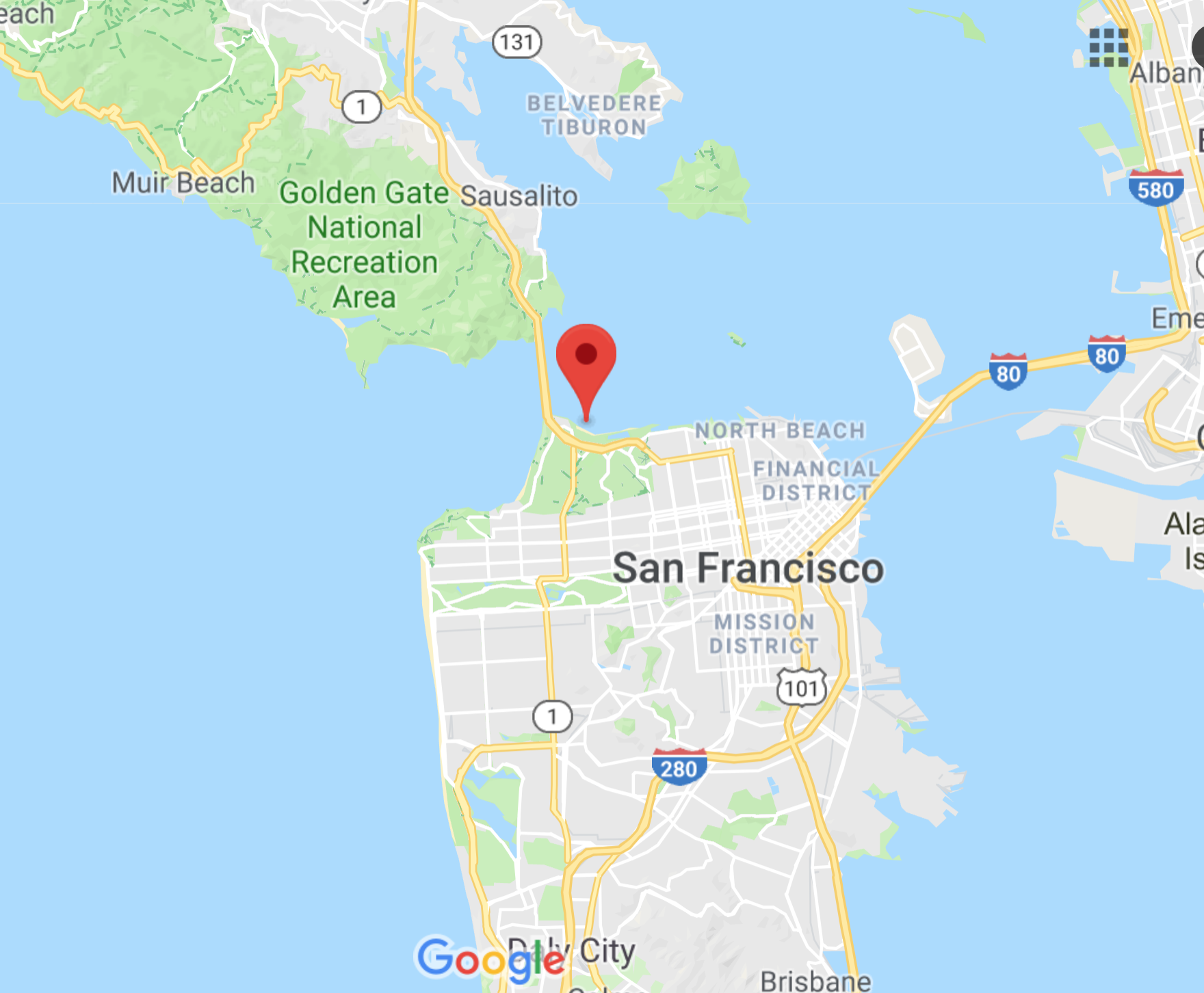
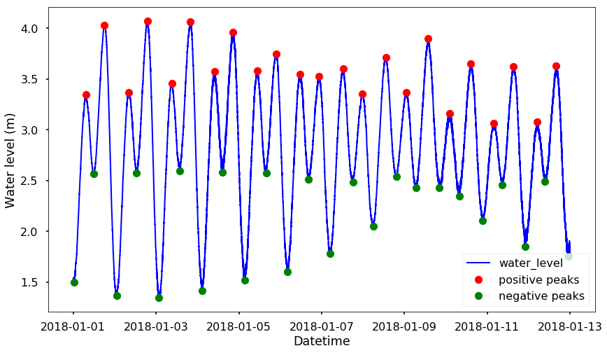
But I want to plot a nice map that has the clustered markers that I can easily see the number of stations in a region. Folium, the package I usually use could do it, but not so beautiful. Therefore, I changed to use google map to generate the nice clustered markers. Here is the code that I modified slightly from Google developers. You can see the following figure as the final results I have (you can find all the locations of the GPS stations here):
png
The code is in javascript, but it should be simple to use it, note that, you need to get your own API key from google, but it should be easy to get it and replace the 'YOUR_API_KEY'
<!DOCTYPE html>
<html>
  <head>
    <meta name="viewport" content="initial-scale=1.0, user-scalable=no">
    <meta charset="utf-8">
    <title>GPS stations</title>
    <style>
      /* Always set the map height explicitly to define the size of the div
       * element that contains the map. */
      #map {
        height: 100%;
      }
      /* Optional: Makes the sample page fill the window. */
      html, body {
        height: 100%;
        margin: 0;
        padding: 0;
      }
    </style>
  </head>
  <body>
    <div id="map"></div>
    <script>

      function initMap() {

        var map = new google.maps.Map(document.getElementById('map'), {
          zoom: 1,
          center: {lat: 37.5, lng: -123.5}
        });


        // Note: The code uses the JavaScript Array.prototype.map() method to
        // create an array of markers based on a given "locations" array.
        /* The map() method here has nothing to do with the Google Maps API,  
        it creates a new array with the results of calling a provided function  
        on every element in the calling array*/
        var markers = locations.map(function(location) {
          return new google.maps.Marker({
            position: location,
          });
        });

        // Add a marker clusterer to manage the markers.  
        // The imagePath gives the icon of the clusters
        var markerCluster = new MarkerClusterer(map, markers,
            {imagePath: 'https://developers.google.com/maps/documentation/javascript/examples/markerclusterer/m'});
      }
      var locations = [
        {lat: -12.466640, lng: -229.156013},
        {lat: -12.478224, lng: -229.017953},
        {lat: -12.355923, lng: -229.118271},
        {lat: 30.407425, lng: -91.180262},
        {lat: 31.750800, lng: -93.097604},
        {lat: 32.529034, lng: -92.075906},
        {lat: -23.698194, lng: -226.117249},
        {lat: -23.766992, lng: -226.120783},
        {lat: -37.771915, lng: -67.715566},
        {lat: 64.028926, lng: -142.075778},
        {lat: -33.768794, lng: -208.883665},
        {lat: -23.698190, lng: -226.117246},
        {lat: -23.766988, lng: -226.120781},
        {lat: 41.838658, lng: -119.653981},
        {lat: 41.853118, lng: -119.607364},
        {lat: 41.850735, lng: -119.577144},
      ]
    </script>
    <script src="https://developers.google.com/maps/documentation/javascript/examples/markerclusterer/markerclusterer.js">
    </script>
    <script async defer
    src="https://maps.googleapis.com/maps/api/js?key=YOUR_API_KEY&callback=initMap">
    </script>
  </body>
</html>

Monday, July 23, 2018

The data I usually use in seismology

As a seismologist, we use many types of data to infer the deformation of the earth, the earthquake source, the site response, etc. This week, I will start to put together a list of data I used before, and links where I usually get the data. I will slowly update the list every week. This will not be a complete list, it will be just the data I used before. Let's start with the seismic catalog data. 

Seismic catalog data

Data description
The seismic catalog data, it is the catalog contains the information of each earthquake. In the most simple version (the catalog data is more complicated), we need the origin time, location, depth, magnitude sorts of information to identify earthquakes. Of course, there is some other information could be in the catalog, for example, the uncertainties associated with the parameters, the stations used to determine the earthquakes, and so on. The catalog data is a spatial and temporal representation of the earthquakes with many other properties. You can also think each earthquake as an object with various properties. 
Data example
They could be easily put into a table, or a CSV file. One example showing below from USGS:
png
Where to download
There are many organizations/countries keep different catalogs, globally or regionally, but what we usually use is from the USGS earthquake catalog, you can see the API page for how to get access to the data in a programming way. 

Seismic waveform data

Tilt data

GPS data

InSAR data

Gravity data


Saturday, July 14, 2018

Plot moment tensors in google earth

I usually need to plot the moment tensors on the map, but plot them in the google earth is really cool. This week, I will blog how to do that based on this blog from my friend Thomas. The original code in his blog is still working fine in Python 2, here I run it in Python 3, which need a little change of the code. You can find all the code on Qingkai's Github. You need to install pykml package first if you don't have it. 
Note: pykml is written in Python 2, and if you are using Python 3 as I am doing it here, then you need to add parentheses for the print function in the factory.py file in the pykml. 
!pip install pykml
image.png
from lxml import etree      #will manage the identation of the kml script
from pykml.factory import KML_ElementMaker as KML #import pykml library 
import datetime as date
import numpy as np
def beachball(data):
    """function to draw beachball using obspy library"""
    import matplotlib.pyplot as plt
    from obspy.imaging.beachball import beachball
 
    mt =data[:, 9:]
    event=data[:,0]                 #index to identify the beachball created
    for j in range(len(event)):
        #create and save beachball in a outfile in the directory where the .py file is 
        beach = beachball(mt[j, :],outfile=str(int(event[j]))) 
The first thing is that we need to generate a file that contains the list of events with the moment tensors, here the format is: index, yyyy, mm, dd, hr, mn, ss, lat, lon, mrr, mtt, mpp, mrt, mrp, mtp
I generated a file called mt_list, let's see the first 3 lines:
!head -n 3 ./mt_list
# index, yyyy, mm, dd, hr, mn, ss, lat, lon, mrr, mtt, mpp, mrt, mrp, mtp
0.00000,2018.00000,5.00000,29.00000,11.00000,56.00000,11.00000,19.41200,-155.28383,-98650000000000000.00000,53510000000000000.00000,45140000000000000.00000,-75790000000000000.00000,9460000000000000.00000,14910000000000000.00000
1.00000,2018.00000,5.00000,30.00000,20.00000,53.00000,50.00000,19.41083,-155.28583,-107650000000000000.00000,45970000000000000.00000,61690000000000000.00000,-78720000000000000.00000,67750000000000000.00000,22930000000000000.00000
#import your data
# the first row isn't used
data=np.loadtxt('./mt_list',skiprows=1, delimiter=',') 
latitude = data[:,7]
longitude = data[:,8]
yyyy,mm,dd=data[:,1],data[:,2],data[:,3]
hr,mn,ss = data[:,4],data[:,5],data[:,6]
index=data[:,0]

#call beachball function 
beachball(data)        

##########################################################################
# create a document element with multiple label style
kmlobj = KML.kml(
    KML.Document(
    )
)   
 
for j in range(len(yyyy)):  #create the ref icons we will use
    kmlobj.Document.append(     
        KML.Style(             
            KML.IconStyle(
                KML.Icon(
                    KML.href('%s.png'%str(int(index[j]))),
                    KML.scale(0.6),   #scale the beachball in googleEarth
                ),
                KML.heading(0.0),
            ),
        id='beach_ball_%i'%j    #gives the icon a ref that will be used later
        ),
    )

# add images to the document element
for i in range(len(yyyy)):
    datum = str(date.date(int(yyyy[i]),int(mm[i]),int(dd[i])))
    ev_time = str(date.time(int(hr[i]),int(mn[i]),int(ss[i])))
 
    kmlobj.Document.append(
        KML.Placemark(
            #~ KML.name('%s'%str(int(index[i]))),   #uncomment this to add a name to the placemark (will always appear in GoogleEarth)
            KML.ExtendedData(                       #I add information about the earthquake, it appears in a table ('info' : value)
                KML.Data(                           
                    KML.value('%s'%datum),          #add value of the specific info
                name ='date'                        #name of'info' you add.
                ),
                KML.Data(
                    KML.value('%s'%ev_time),        #add value of the specific info 
                name ='time'                        #name of 'info' you add.
                ),                                     #more data can be added, following the same structure (line 65-68)
            ),
            KML.styleUrl('#beach_ball_%i'%i),       #get the correct beachball in the directory as marker
            KML.Point(
                KML.coordinates(longitude[i],',',latitude[i]),
            ),
 
        ),
    )

print(etree.tostring(etree.ElementTree(kmlobj),pretty_print=True))

outfile = open('Focal_mechanism_devy.kml', 'wb') #save the kml structure code
outfile.write(etree.tostring(kmlobj, pretty_print=True))

Friday, July 6, 2018

Find peaks in data

This week, we will talk about how to identify the peaks from a time series. For example, the 2nd figure below. How do we find out all the location of the peaks? let's play with the coastal water level data from NOAA. You can choose the station you like. I choose the one at San Francisco, station - 9414290, the latitude and longitude of this station are 37.806331634, -122.465919494, you can see the station location on the following map:
image.png
I just downloaded the first 12 days in 2018, you can also quickly download this data from my repo here. You can find the notebook on Qingkai's Github written in Python3. 
Let's first plot the time series data for the water level at this location.
import matplotlib.pyplot as plt
import pandas as pd
plt.style.use('seaborn-poster')

%matplotlib inline
df_water_level = pd.read_csv('./data/9414290_20180101to20181231.csv', skiprows = 10, delimiter='\t', names=['datetime', 'water_level'])
df_water_level['datetime'] = pd.to_datetime(df_water_level['datetime'])
df_water_level = df_water_level.set_index('datetime')
plt.figure(figsize = (14, 8))
plt.plot_date(df_water_level.index, df_water_level.water_level, 'b-', linewidth = 2)
plt.xlabel('Datetime')
plt.ylabel('Water level (m)')
plt.show()
png

Let's find the peak

Since version 1.1.0, scipy added in the new function find_peaks that gives you an easy way to find peaks from a data series. It has various arguments that you can control how you want to identify the peaks. You can find more details and more advanced examples here. The two arguments I found really useful and easy to use is the height and distance. The height argument is the required height of peaks. And the distance is the required minimal horizontal distance in samples between neighboring peaks. Let's use see more in the following example
import scipy.signal
Here, we can see from the figure that all the positive peaks are roughly higher than 2.5, therefore, we set height = 2.5, which means that it will detect the peaks that higher than 2.5. Then for the distance parameter, I usually play with different numbers and see which one gives me the best result, for this case, I found distance = 500 is fine. 
# find all the peaks that associated with the positive peaks
peaks_positive, _ = scipy.signal.find_peaks(df_water_level.water_level, height = 2.5, threshold = None, distance=500)
plt.figure(figsize = (14, 8))
plt.plot_date(df_water_level.index, df_water_level.water_level, 'b-', linewidth = 2)

plt.plot_date(df_water_level.index[peaks_positive], df_water_level.water_level[peaks_positive], 'ro', label = 'positive peaks')

plt.xlabel('Datetime')
plt.ylabel('Water level (m)')
plt.legend(loc = 4)
plt.show()
png
One thing is that, this find_peaks function can only detect the 'real' peaks, but not the troughs. You can see none of the troughs in the above figure were identified. One simple solution is that, we flip the data so that all the troughs become peaks. And now we could identify all the peaks and troughs. 
# find all the peaks that associated with the negative peaks
peaks_negative, _ = scipy.signal.find_peaks(-df_water_level.water_level, height = -3, threshold = None, distance=500)
plt.figure(figsize = (14, 8))
plt.plot_date(df_water_level.index, df_water_level.water_level, 'b-', linewidth = 2)

plt.plot_date(df_water_level.index[peaks_positive], df_water_level.water_level[peaks_positive], 'ro', label = 'positive peaks')
plt.plot_date(df_water_level.index[peaks_negative], df_water_level.water_level[peaks_negative], 'go', label = 'negative peaks')

plt.xlabel('Datetime')
plt.ylabel('Water level (m)')
plt.legend(loc = 4)
plt.show()
png
Of course, there are various arguments that we could use to filter out the unwanted peaks, see the documentation for more details.