Sunday, January 28, 2018

Learning QGIS: Change the style of the layers

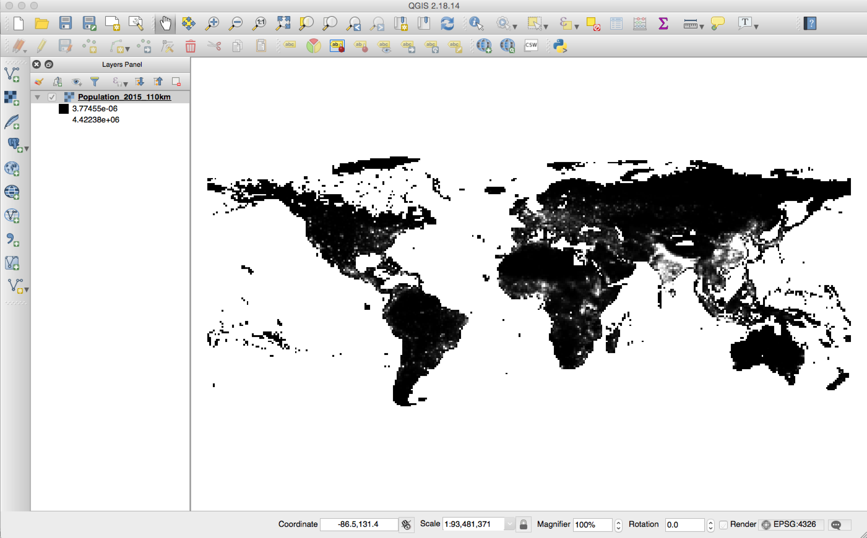
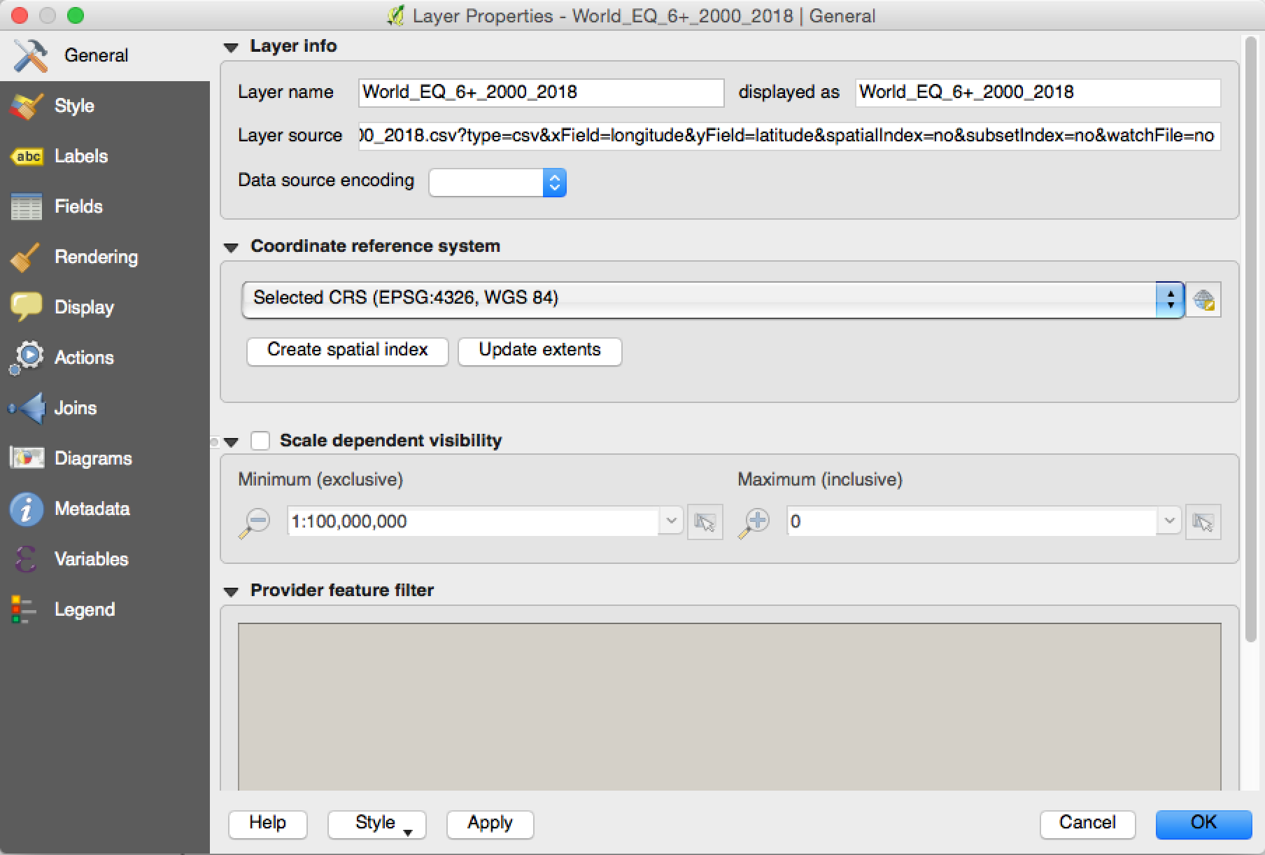
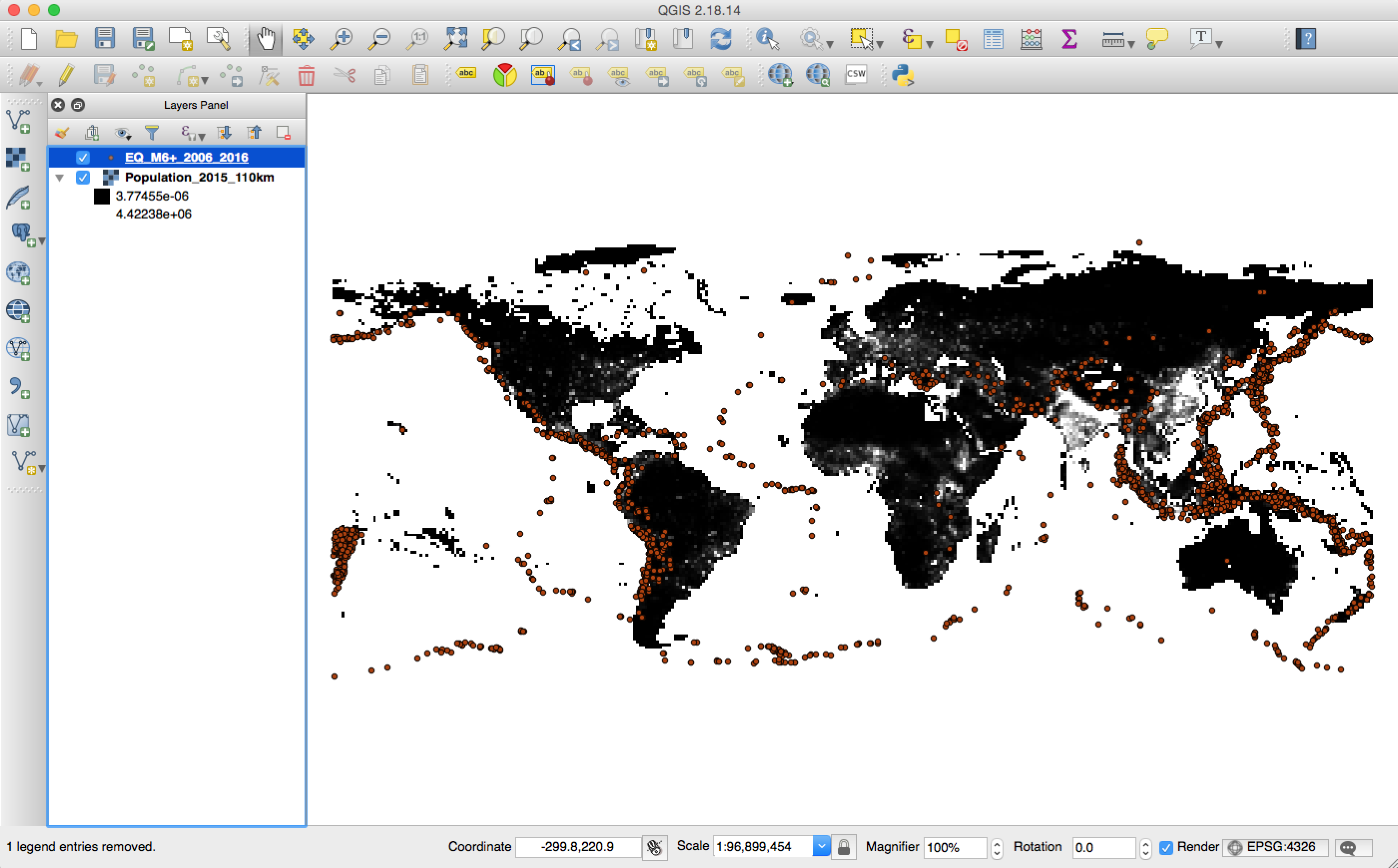
Continue from last week, we have the population and earthquake data in QGIS, which looks like the following:
png

Change the color of population

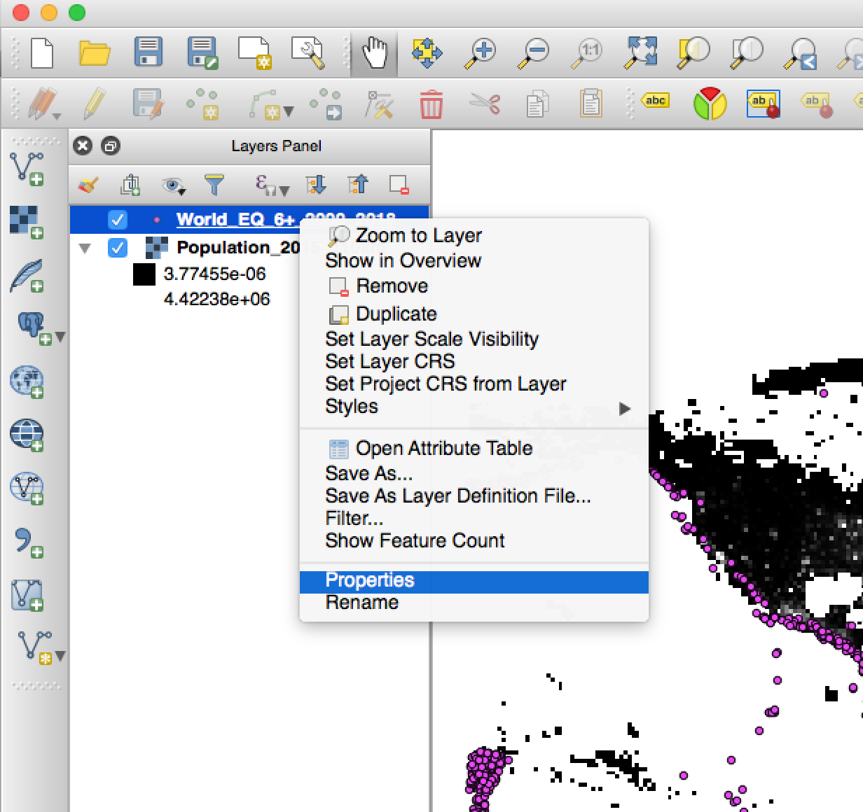
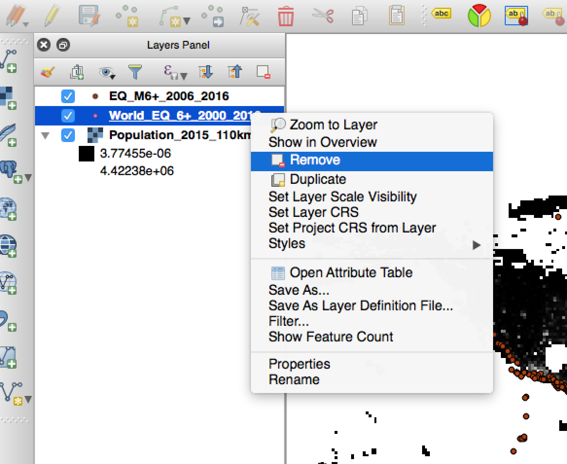
We can see that the background population basically is black. The first thing we want to do is to change it so that the population will be shown as different colors based on the count of the population. We can achieve this by changing that in the style tab in the properties of this layer (you should remember how to find it, right? Just right click the https://raw.githubusercontent.com/qingkaikong/blog/master/2018_02_QGIS_style/figures/layer, and choose the properties).
png
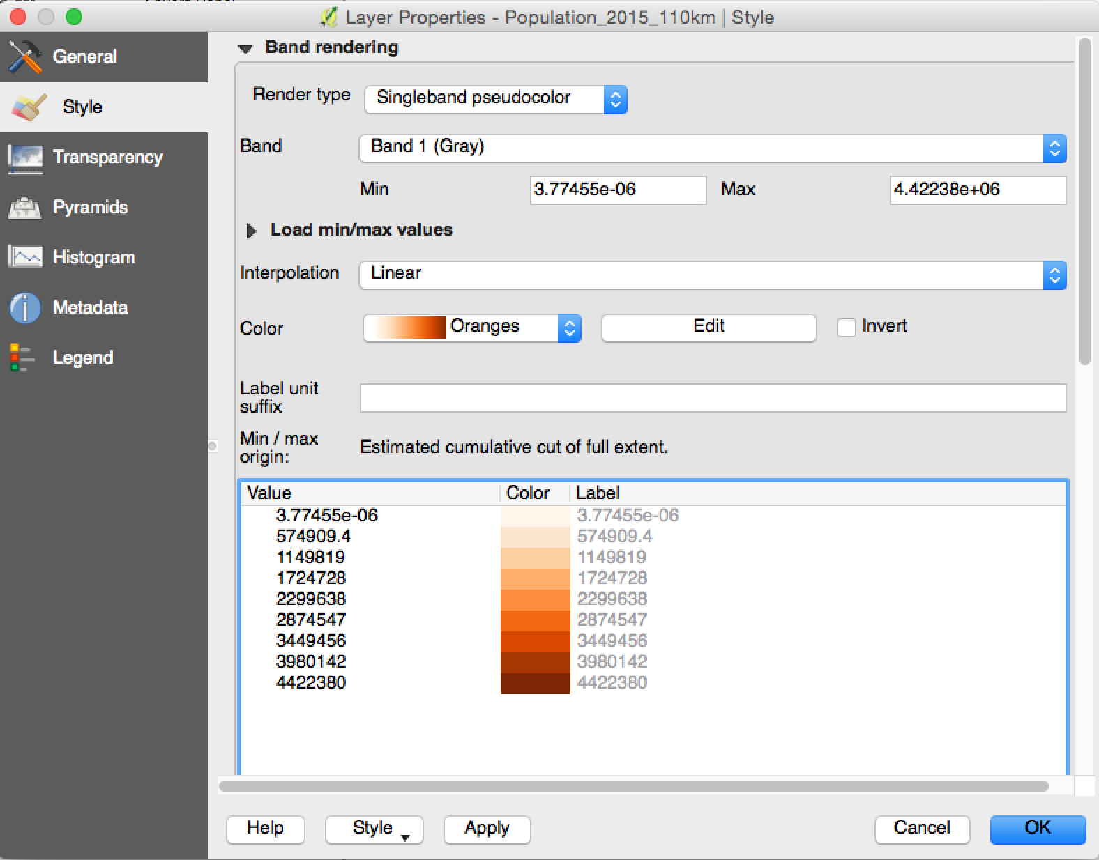
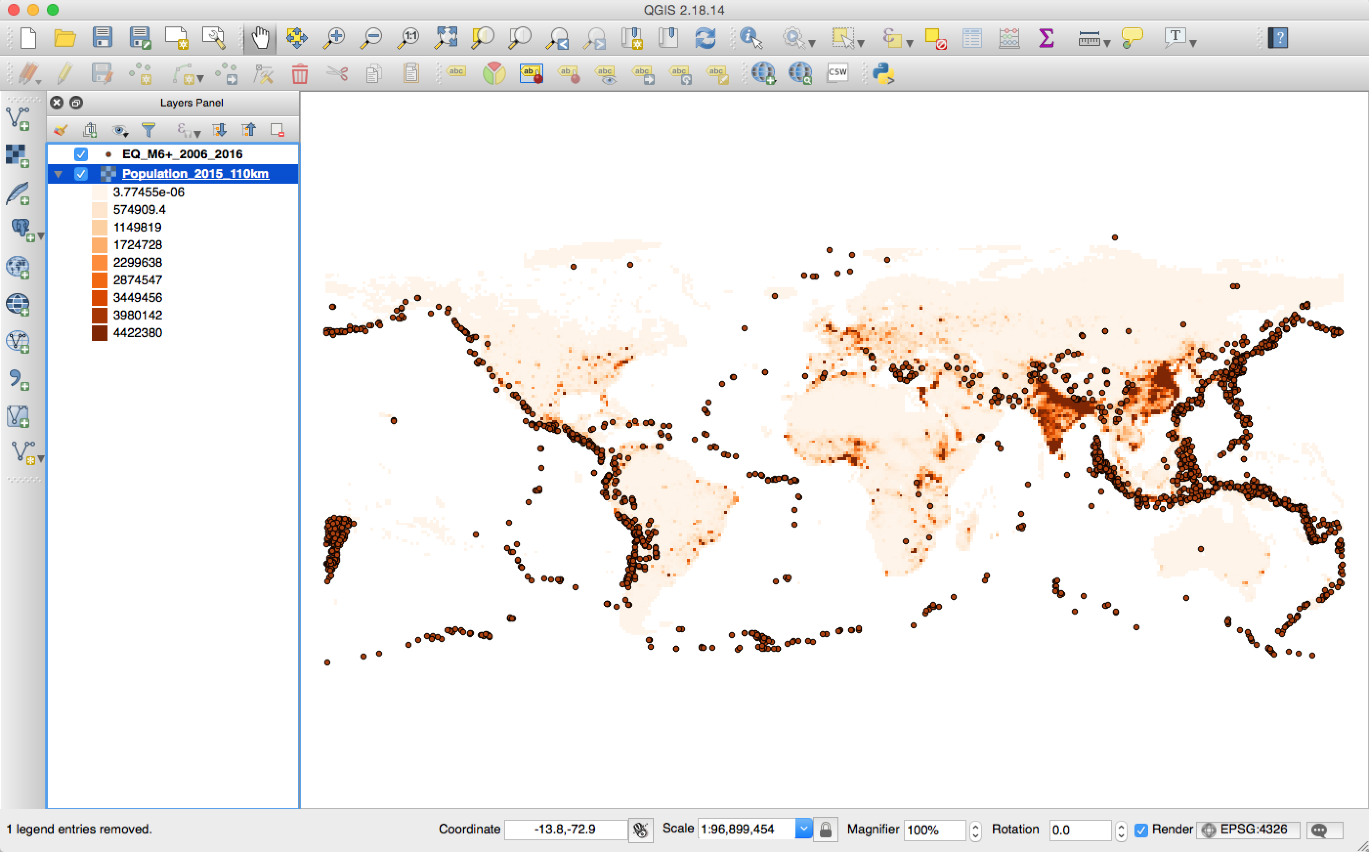
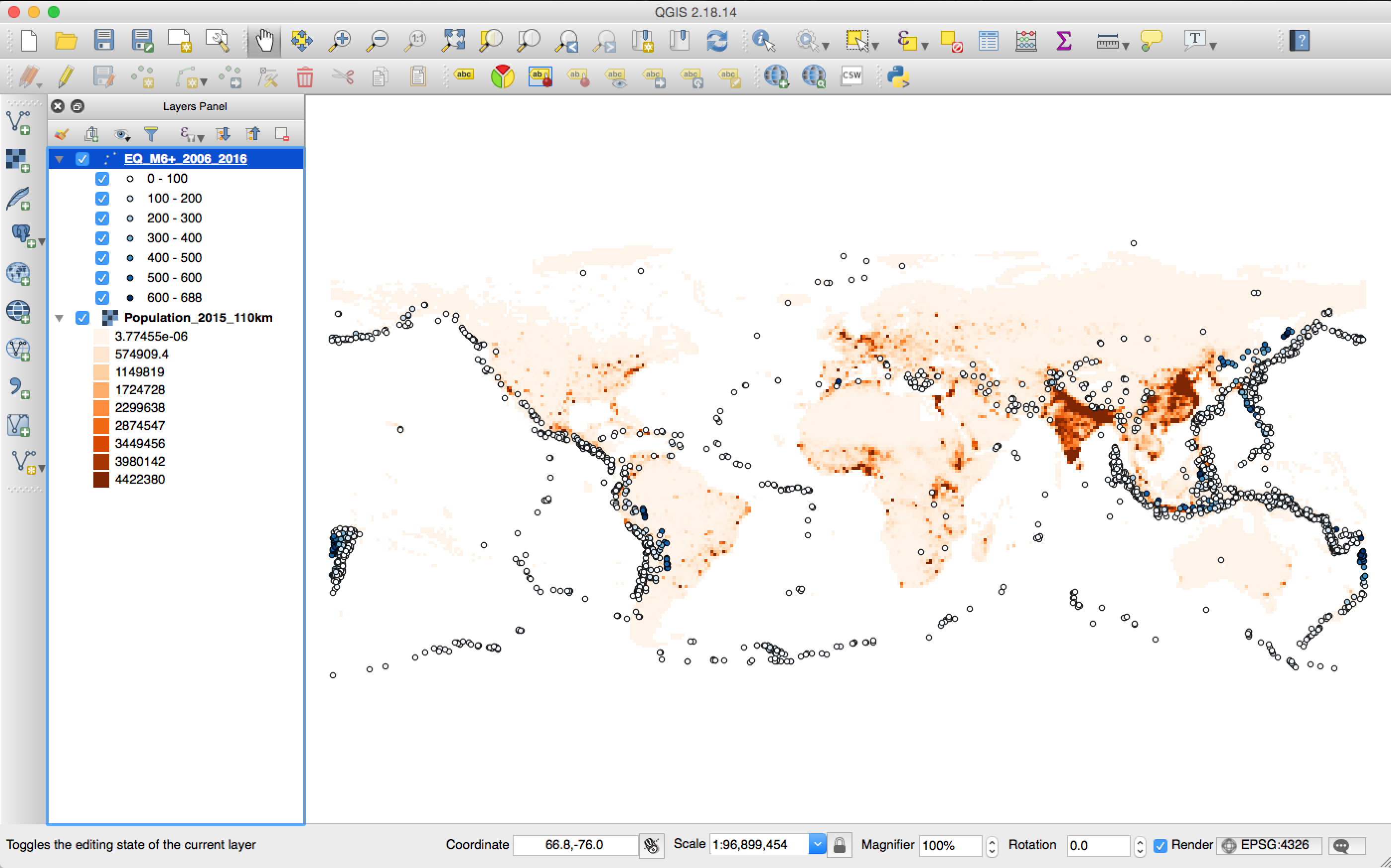
Let’s change the Render type to ‘Singleband pseudocolor’, and change the Color to ‘Oranges’. You can see that QGIS will automatically order generate a list of colors based on different population count. Of course, you can click the ‘Edit’ near the color to change the bins of the divide, that is how many colors you want. Also, you can change the value for each color to the one you want to divide, for example, I want the first color is 0, and the 2nd color is 0 to 100. All you need to do is to click the value for the 1st and 2nd value, and change to the values you prefer. Since the automatic values look good to me, I will not change it here. After you click ‘Ok’ button, you will see the map showing the population based on the colormap we just selected: the denser the population, the darker red it is, as shown in the following figure.
png

Show depths and magnitude for earthquake data

change the color

Now, we want to change the earthquake data as well: we want the color of the circle to show different depths, and the size of the circle to show the magnitude of the earthquake. Basically, we want the deeper the earthquakes are, the darker the colors are, and the larger the size of the circles, the higher magnitudes of the earthquakes. Let’s do the color first. We do this in the style tab for the earthquake layer.
png
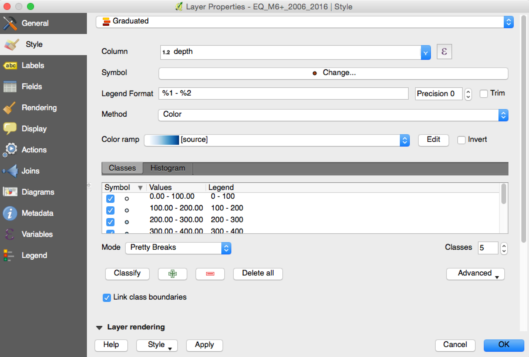
As shown in the above figure, we change the style to ‘Graduated’, and choose the ‘Column’ as depth. We also change the method to ‘Color’, and select the color ramp as we want. This is telling the QGIS that we want to do the graduated color based on the depth column. After this, you can click the ‘Classify’ button. You will see the different value levels will have a different color. Note that, I select the ‘Mode’ as Pretty Breaks, you can play with other options or manually change it. Now click ‘Ok’, you will see the following figure that earthquakes are color-coded with the depth now.
png

change the size

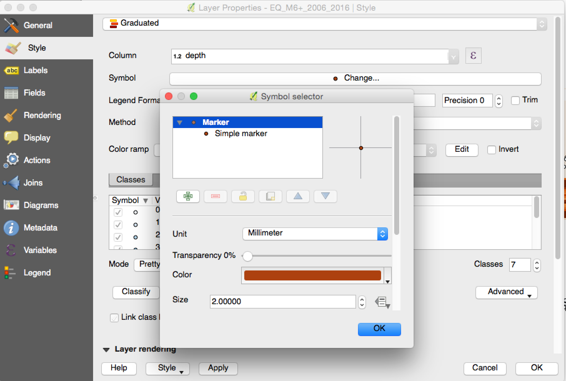
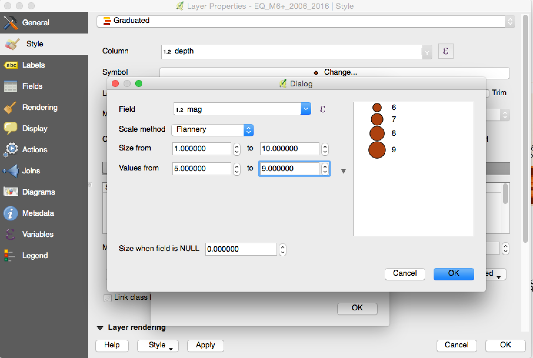
Now, let’s change the size of the earthquakes. We go back to the style tab in the properties. Click the ‘Symbol Change …’, which will bring the Symbol selector as shown in the following figure:
png
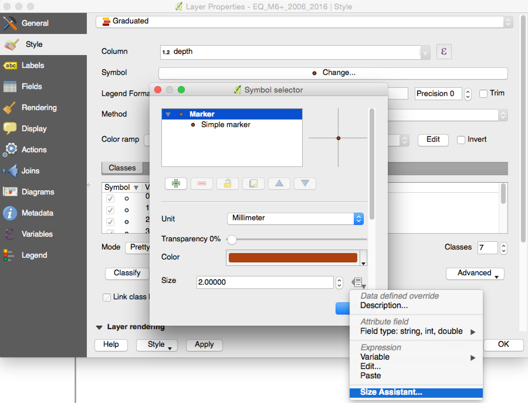
Now click the icon to the right of the ‘Size’, which will bring up a dropdown list. Select the ‘Size Assistant…’:
png
Change the field to ‘mag’ and you can also change the ‘Size from’ and ‘Values from’ as you prefer, as shown in the following image:
png
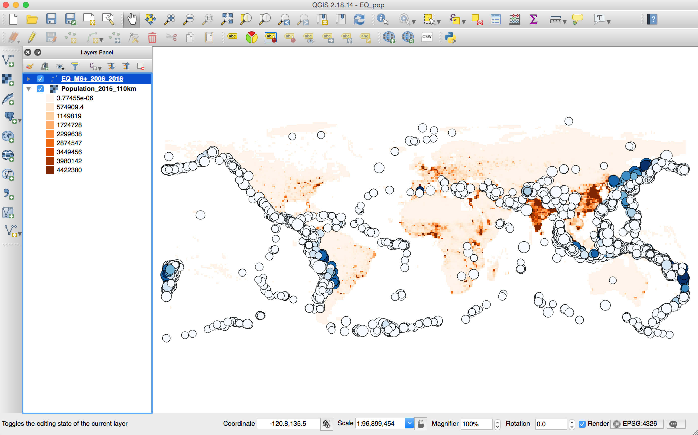
After you set the size, and you can see that your earthquakes now have different sizes based on the magnitude:
png
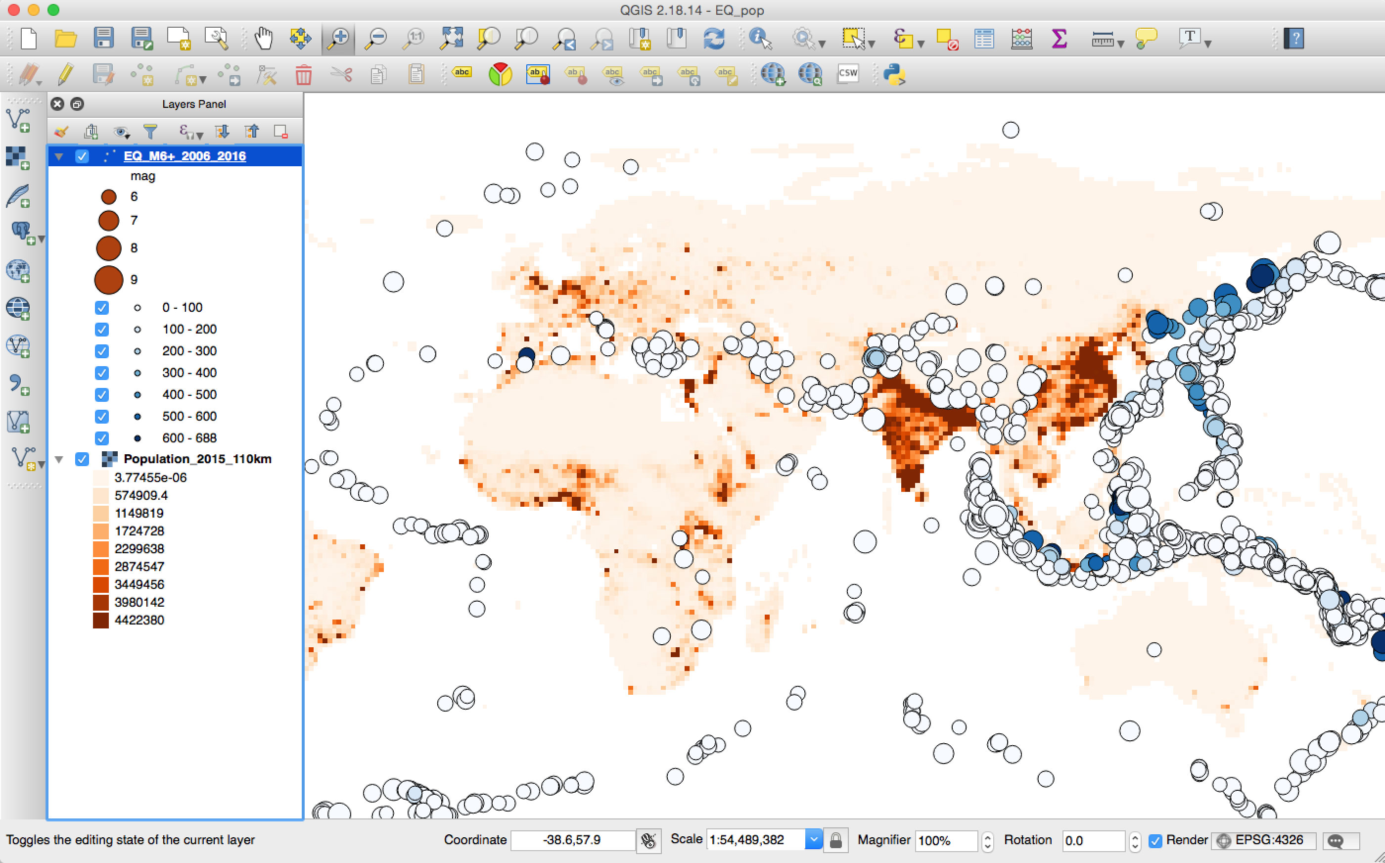
Expand the earthquake layer in the ‘Layers Panel’, you can find your legend there:
png
Now, you have a nice map of showing the population in different colors and the earthquakes with different depth and magnitude.

Sunday, January 21, 2018

Learning QGIS - Import data and change projection

I am currently learning QGIS by attending the workshop at D-Lab, Geospatial Data and Mapping Fundamentals. Here I am using a small project to show what I learned the basics.
The goal of this small project is to make a map with the population count and the earthquakes worldwide, so that we can easily see where are the most dangerous places on earth.

Data download

First we need to download the population grid count data from Socioeconomic Data and Applications Center, I downloaded the population count data for 2015 at the resolution about 110km for demonstration purposes (you can download more higher resolution ones), you can find the population count data in GeoTiff here. And the earthquake data by query USGS catalogs, I’ve already downloaded the worldwide earthquakes larger than M6 from 2006 to 2018, you can find it here.

Import data into QGIS

Let’s load the data into the QGIS first. Since the population data is a GeoTiff, which is a raster file, we can add a raster layer as shown in the following figure:
png
The earthquake data is a vector data, and it can be added as a vector layer as the following figure, the QGIS is smart enough to find out the latitude and longitude as the Y and X field. You don’t need to change anything:
png
After we add the earthquake data, it now looks like this:
png

Change the projection

Many times, you will find that different data will have different projections. In a simple sense, the projection is the rule when you want to show things on the earth (3D sphere) onto a 2D Map. There are different projections, and if your data are in different projections, they will not line up in the map. Therefore, you need to make all the layers have the same projection.
You can find the projection of the data by right click the layer in the ‘Layers Panel’, and click the properties. The projection of this layer will be shown in the ‘General’ tab. As shown in the next two figures:
png
png
Note that, you can not change the projection here (even you change it here, the underlying projection is still the old one). If you want to change the projection, do the following steps:
Step 1:
Right click the layer you want to change the projection, and choose ‘Save as’:
png
Step 2:
A popup window will ask you the new name you want to save, and in the ‘CRS’, you can choose your new projection system.
png
Click the small global near it, and in the popup window, you can type ‘4326’ in the ‘Filter’, which will list the name of the projection system below. (in our case, we don’t need to change, but if you need change to another projection, just find it here)
png
Step 3:
After you save it as a new layer, you will see that in the ‘Layers Panel’. Remove the old layer:
png
Then you will have all the new layer with the new projections. Do this for all the layers in different projections (usually you change the vector layers to the projection system which the raster layer use)
png
Dada, we can see the above figure, we have the data loaded into the QGIS, but the population is all black, we want to change the color of the population based on the count, and for the earthquakes, maybe use the size of the circle as the magnitude and color it by using the depth. How we can do this? We will talk this next week.

Saturday, January 13, 2018

Convert word document to PDF with hyperlinks on Mac

Recently, I need to generate a PDF from a word document on Mac with hyperlinks in it. I found that if I directly print it to PDF, the hyperlinks will not work anymore. It searched online, and found two ways that I can have the hyperlinks work again.

First my system:
OS X Yosemite (10.10.5)
Microsoft office 2011

The solution:
Option A - Don't need internet

If you have Pages installed on your Mac, you can directly load the word document with Pages, and export it as PDF. You will happily see the hyperlinks work!

Option B - Need internet

Open a new google doc, and from the File->Open, this will open the word document in the google doc. Then choose File->Download, select as PDF. This way will output the PDF with the valid hyperlinks.

Friday, January 5, 2018

2018 - I am coming

How time flies! We are at 2018! Happy new year, everyone!

Look back of last year, I feel I am really lucky to have so much different experiences, the selected highlights are:

  • I had a faculty job interview at one university, even though I didn't get the job, I learned so much from the experience. This will be really useful for the future. 
  • I took a course at Berkeley to learn entrepreneurship. It is an eye opener course that have many different things than that in doing research. I also found a lot of the things I learned from this course could be applied back to research as well. 
  • My son was born before the summer starts, now I have a daughter and son! Task completed!
  • I attended the NSF I-Corps program, very intensive and so unique that I will never forget the moments during the 7 weeks! Since I talked to about ~140 people within a very short time, a byproduct is that I will not be shy anymore to talk with anyone in the world ^_^
  • I visited Harvard, MIT, and BU, and tasted the different flavors of the 3 great universities! I really love the city - Boston! 
  • I bought a full size 88 weighted key piano, and started to learn! So much fun with it!
  • Last, but not the least, my first AGU outside of SF! And my first time to serve as a session chair, so proud!
2018, a big year ahead of me. I don't know what will happen, but I know, if I continue to work hard, and luck will come! Enjoy work, enjoy life! 2018, I am coming!