We talked how to use QGIS to generate a map with population and seismicity. This week, we will talk generate a similar map using
ArcGIS online, but much easier steps and an easy sharing option. I think for creating a simple map, it is free, but if you want more advanced features, then it does
cost to use it. I will show the free part of it, creating a simple map and share it. I will first show the results from it, you can get access to the map via
this link. I can also embed this map here to show you how easy we can share an interactive map with the world using this method (try to move to different regions, or click the earthquake on the map):
How to make it
Now, I will show you how did I make it.
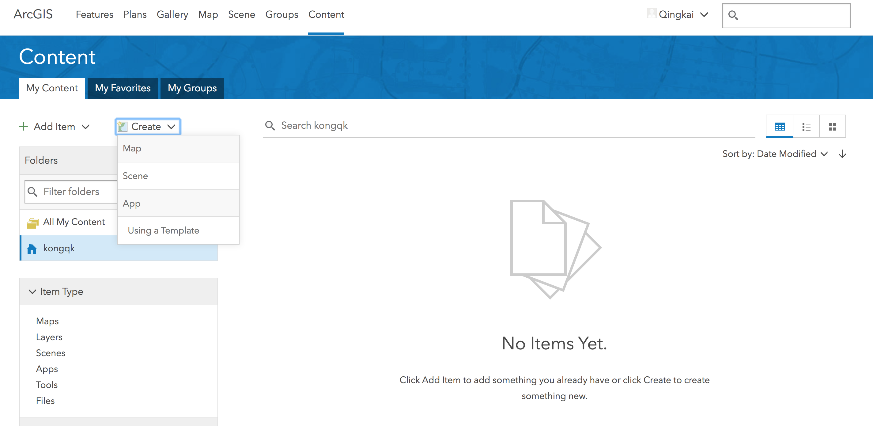
Step 1 Create a map
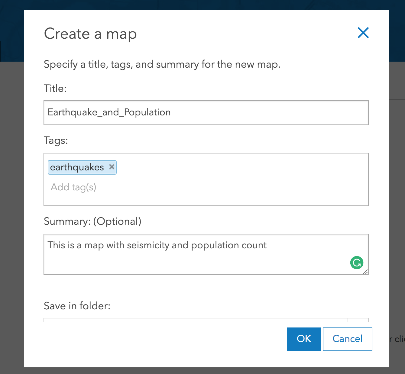
This step is relatively easy, you go the ‘Content’ tab after you signed in, and click the ‘Create’ button, and choose ‘Map’ as shown in the following figure:
Then you fill in all the informaiton about this map:
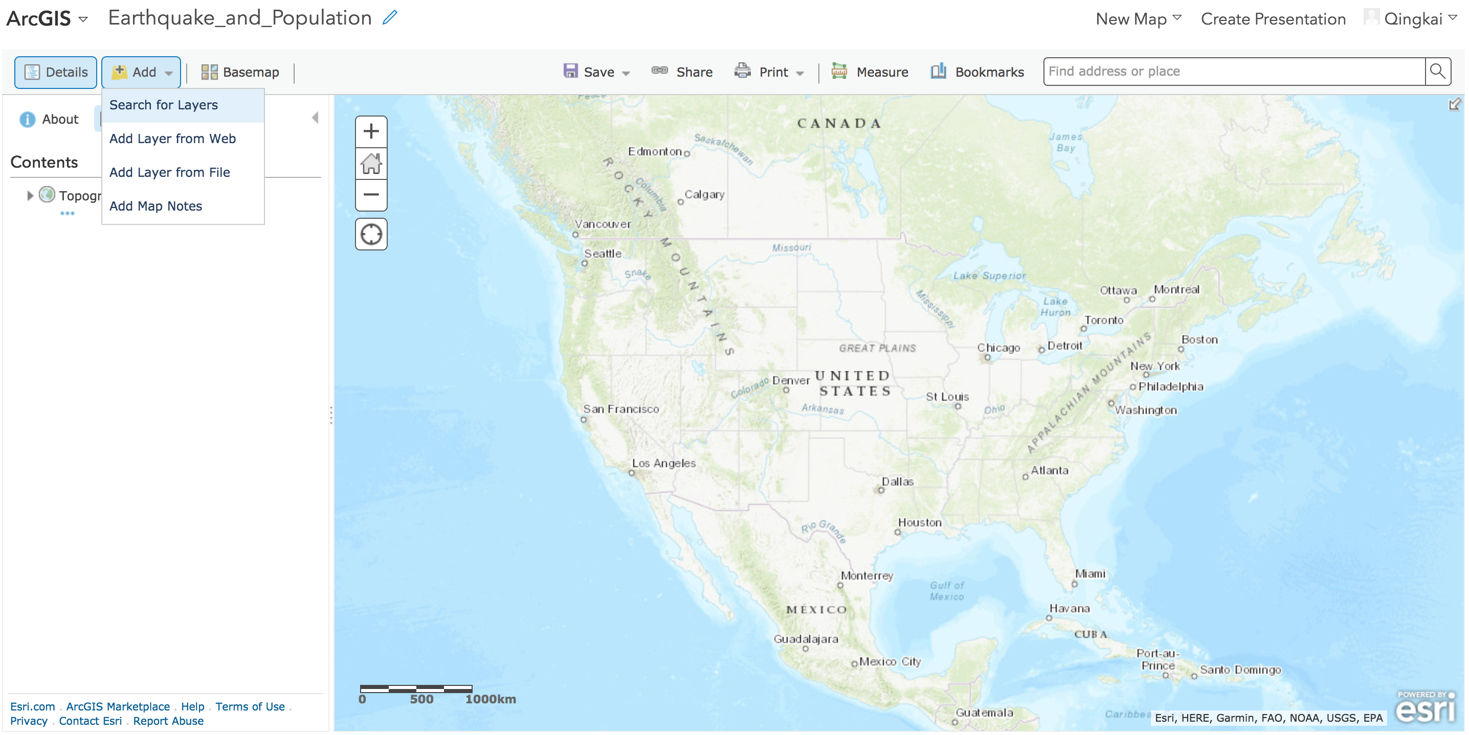
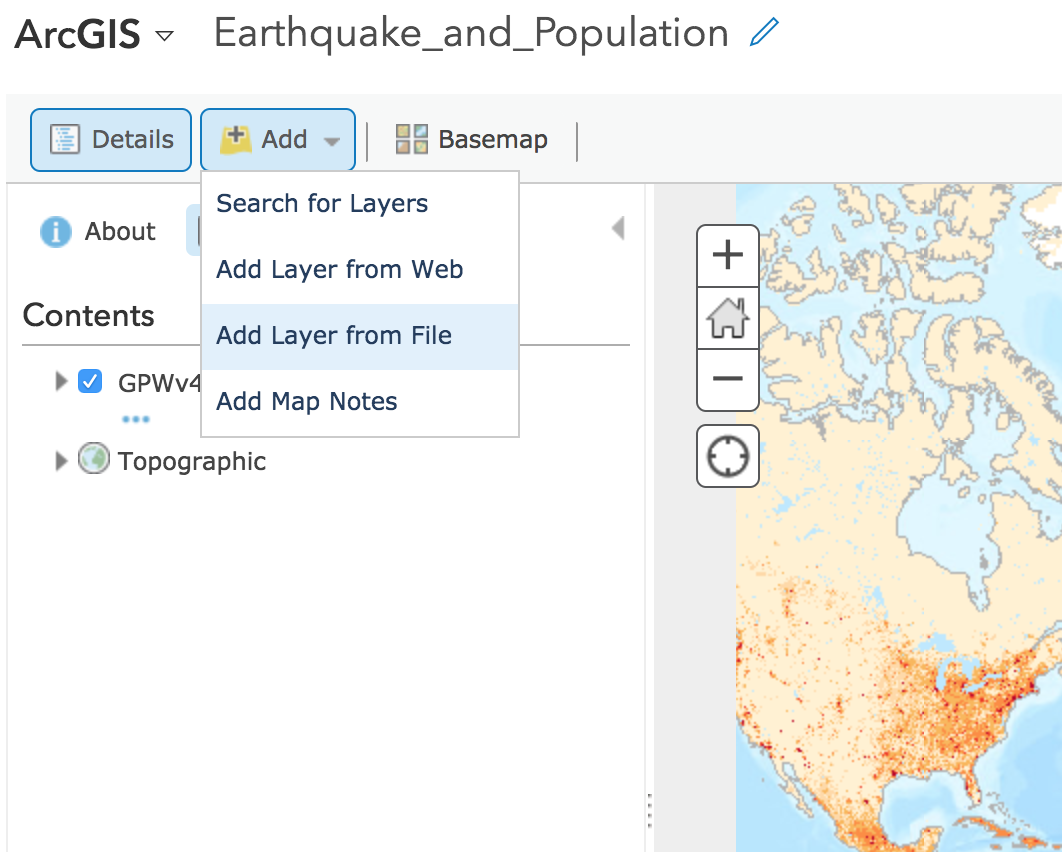
Step 2 Add the population data
After you filling in all the information to create a map, you will see something similar to the map below, and choose ‘Search for layers’ from the ‘Add’:
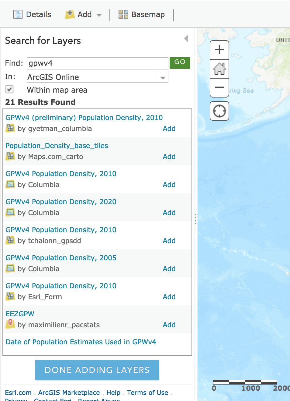
There are many layers online already, especially on the ArcGIS Online, therefore, let’s just search gpwv4 on the ArcGIS Online.
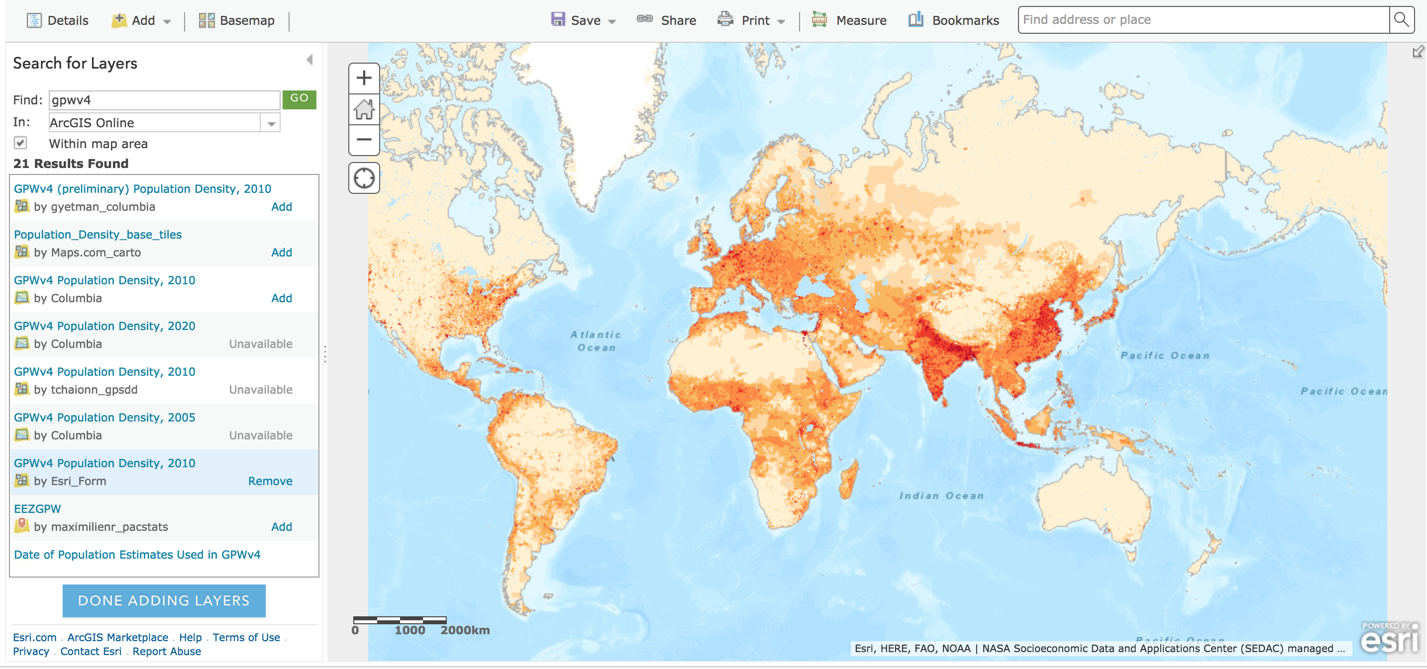
After I select the ‘GPWV4 Population Density, 2010’ layer, you can see the population data will show directly on the map. So simple!
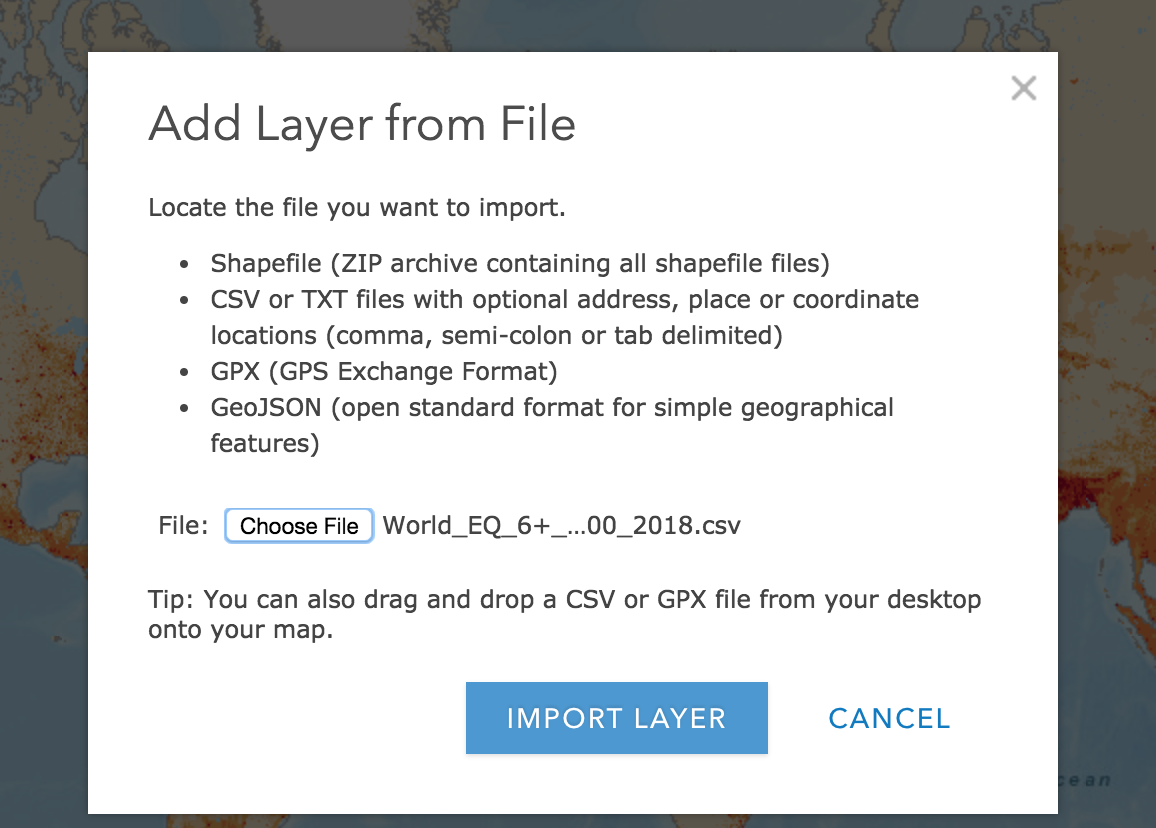
Step 3 Add the earthquake data
Now, let’s add the earthquake data (I’ve already downloaded the worldwide earthquakes larger than M6 from 2006 to 2018, you can find it
here). This time, we can directly add data from our local file, you can see the following two figures.
After you import the layer, you can see the earthquake data on the map (I was lazy to change the zoom in level on the map, therefore, you see them all squeeze into the center, you can just change it)
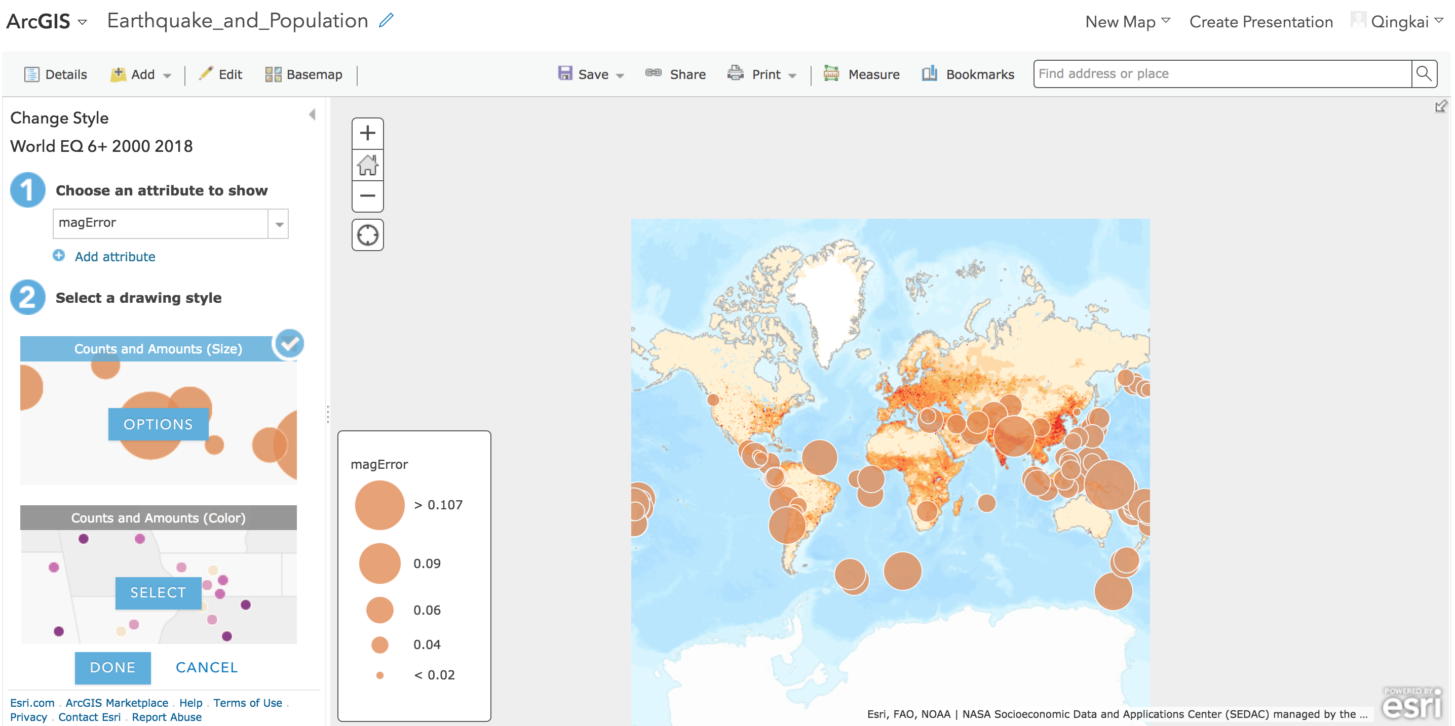
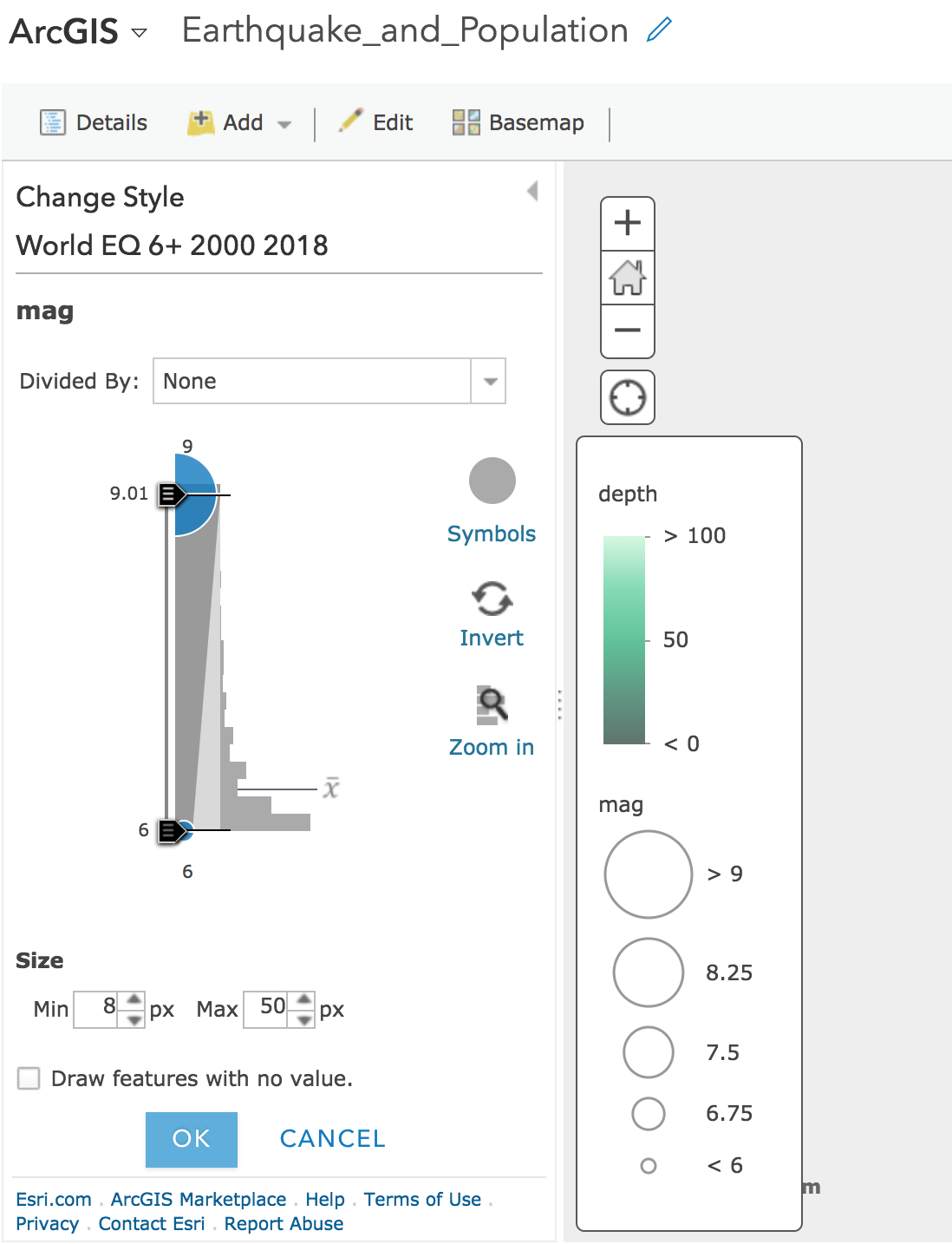
Step 4 Change the style
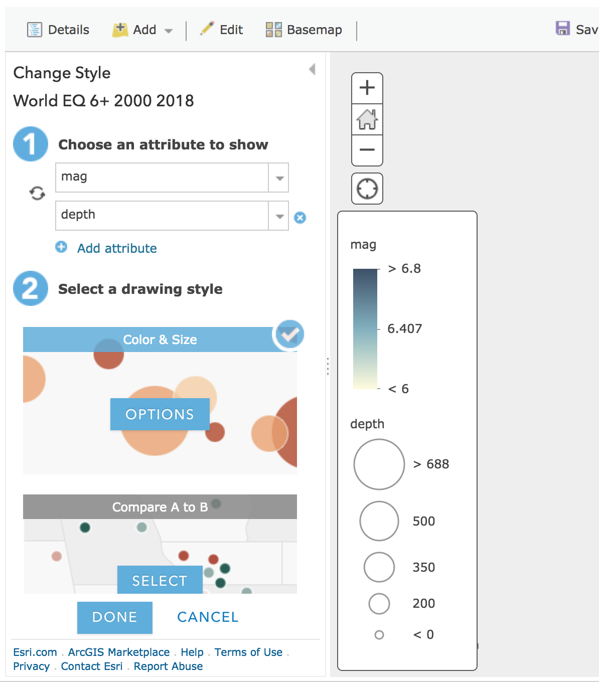
As we showed before, we want to show the earthquakes in different colors to represent depths and different sizes as magnitudes. We can do this by choose the magnitude as the attribute to show (there are many attributein the earthquake csv file)
We can add ‘depth’ as the other attribute we want to display:
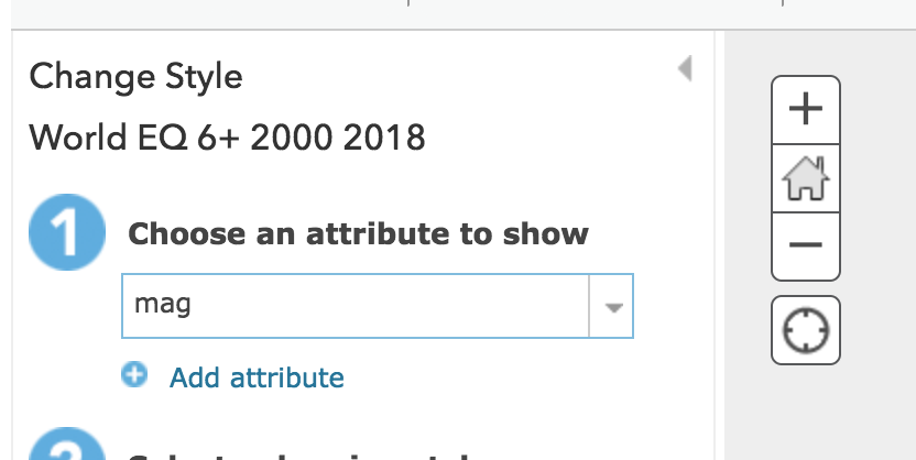
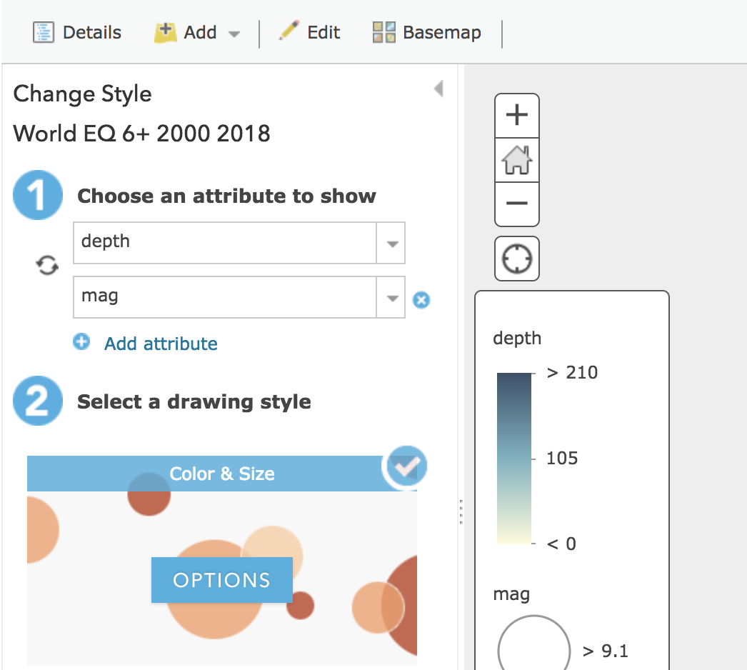
Now we can see in the above figure that the system automatically shows different colors as magnitudes and sizes as the depth, let’s swap them:
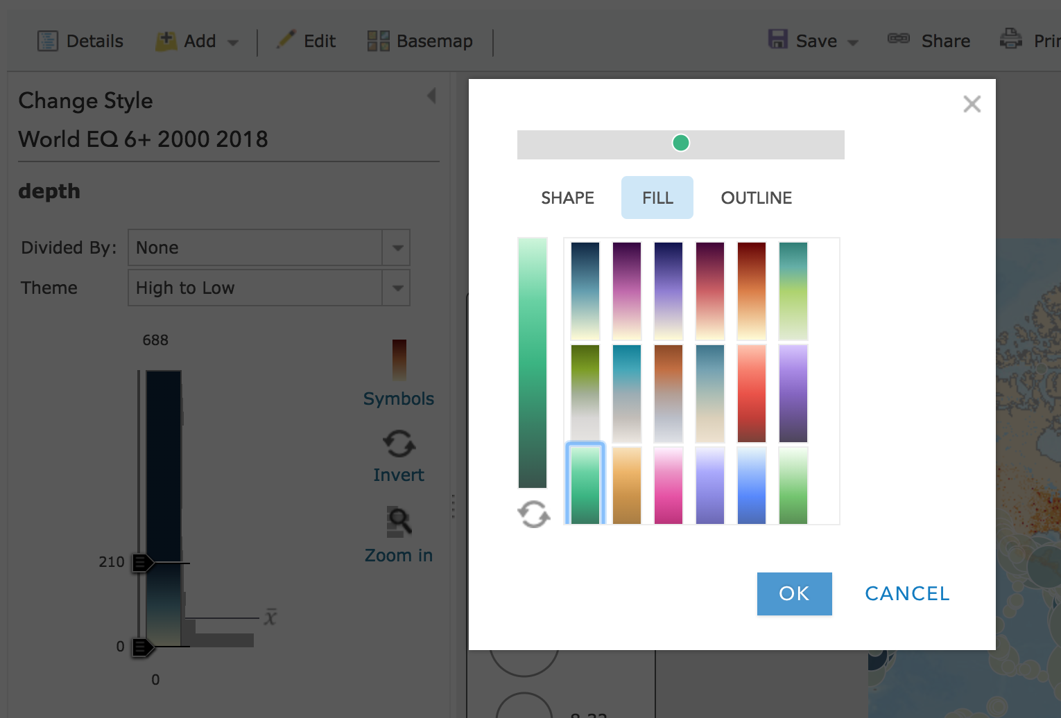
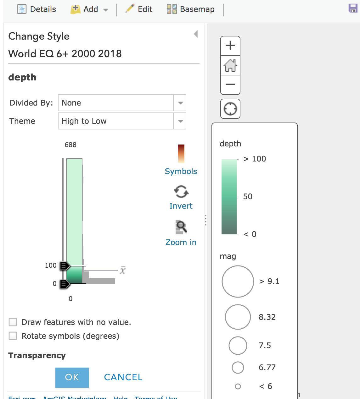
We can change the fill color for the depth, and move the breaks on the left panel to set which color corresponding to the different depths, here I choose 100, which results in a legend 0 to 50, and 50 to 100, and 100 above. But I didn’t figure it out how to add more breaks, let me know if you know how to do it.
Do similar thing for the depth:
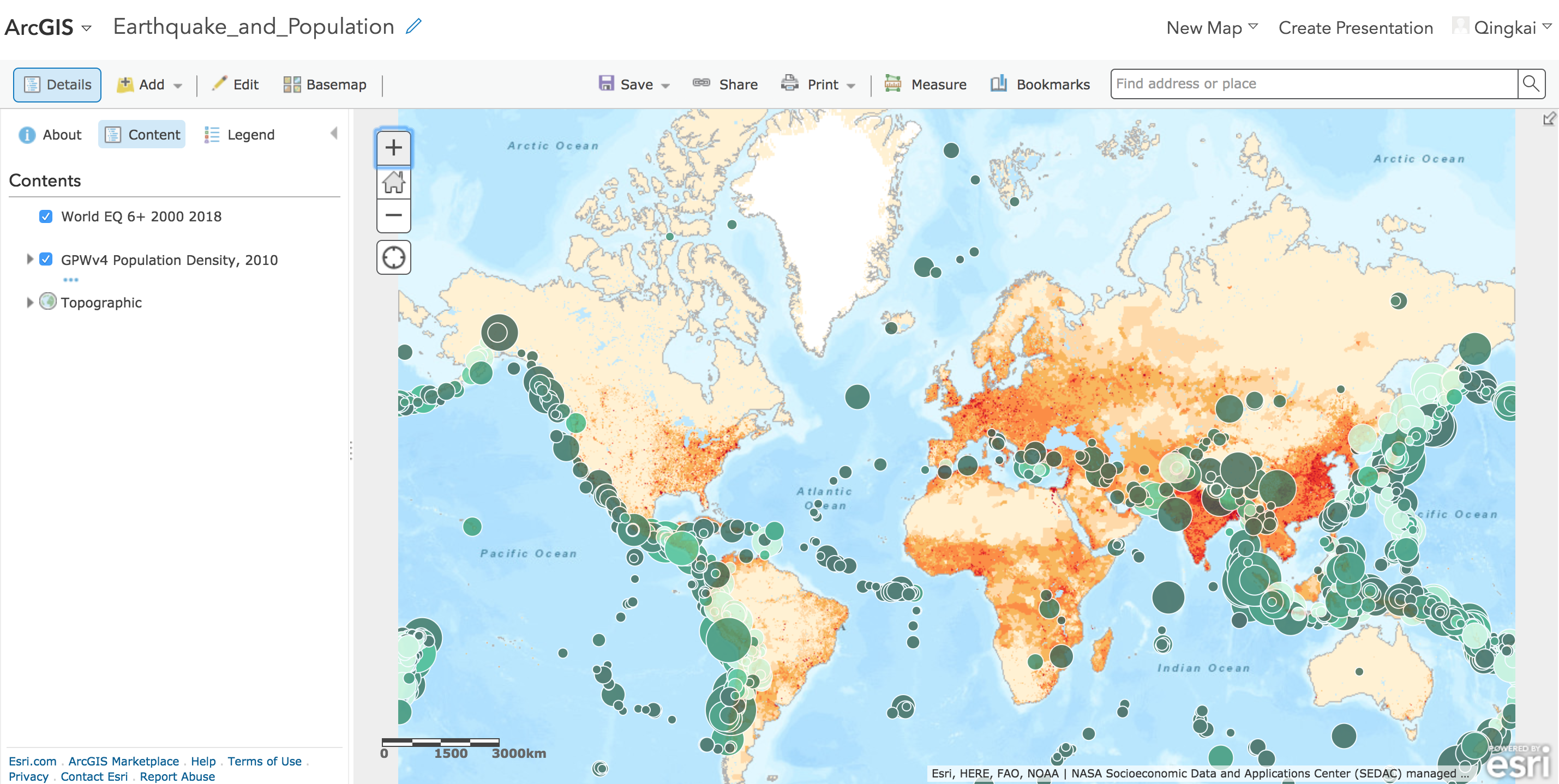
After you finish changing the depth and magnitude, now you can see we have a very nice map:
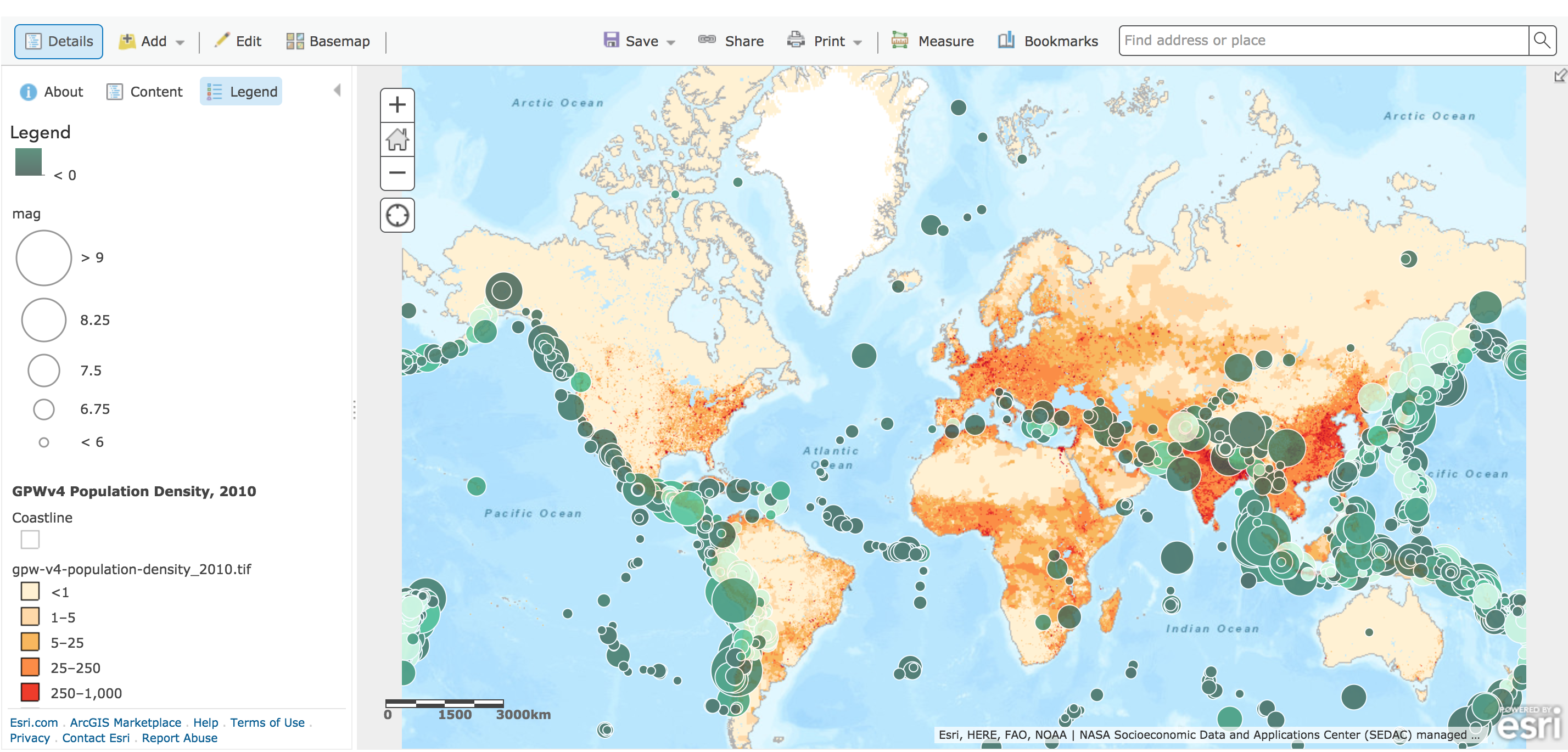
Select the Legend to see the legend for different data:
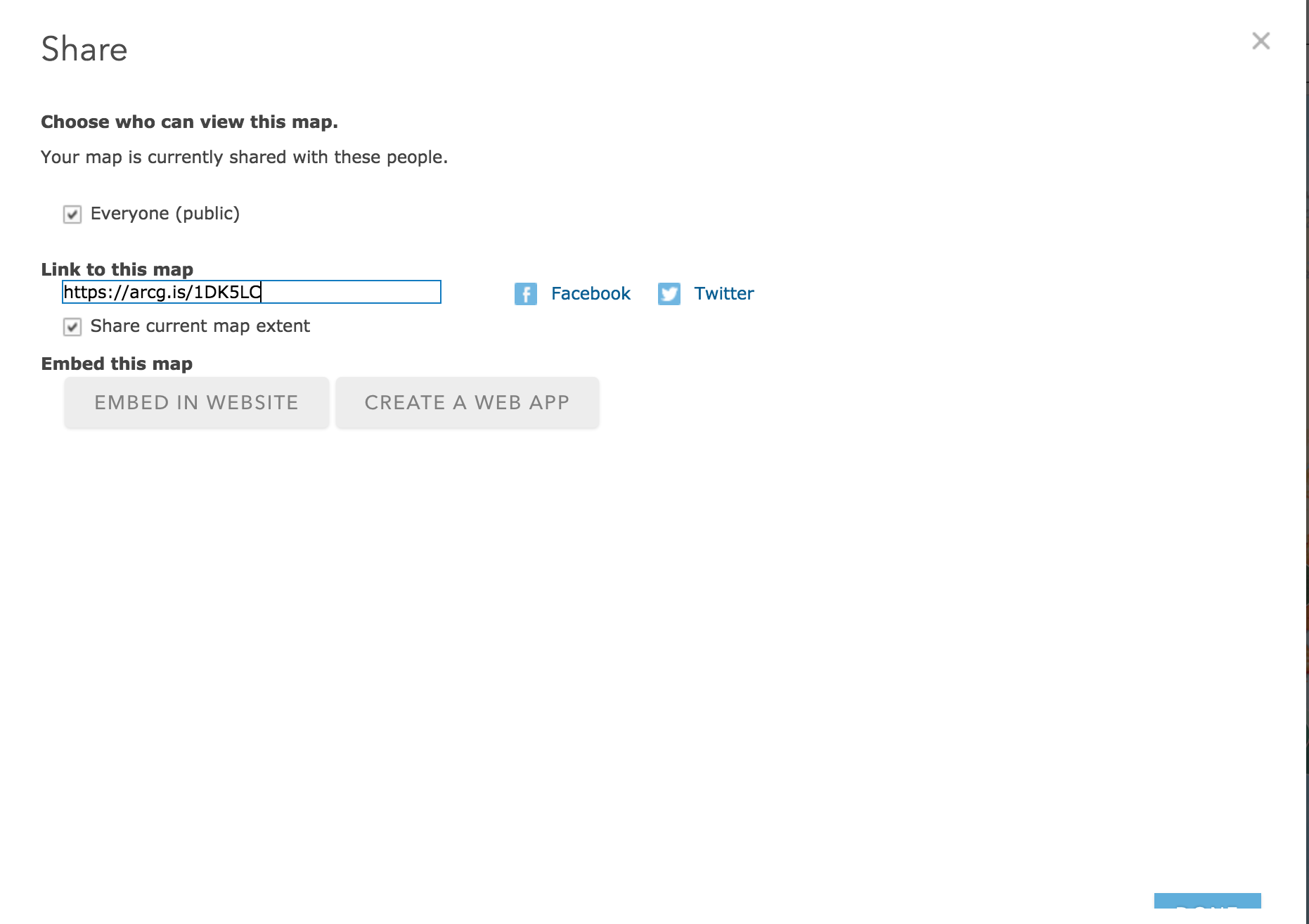
Step 4 Share the map
After you finish the map, you can easily share the map by just click the share button, if you choose everyone, anyone with the link showing there can get access to your map. Also, you can embed the map to your website as well:
More features
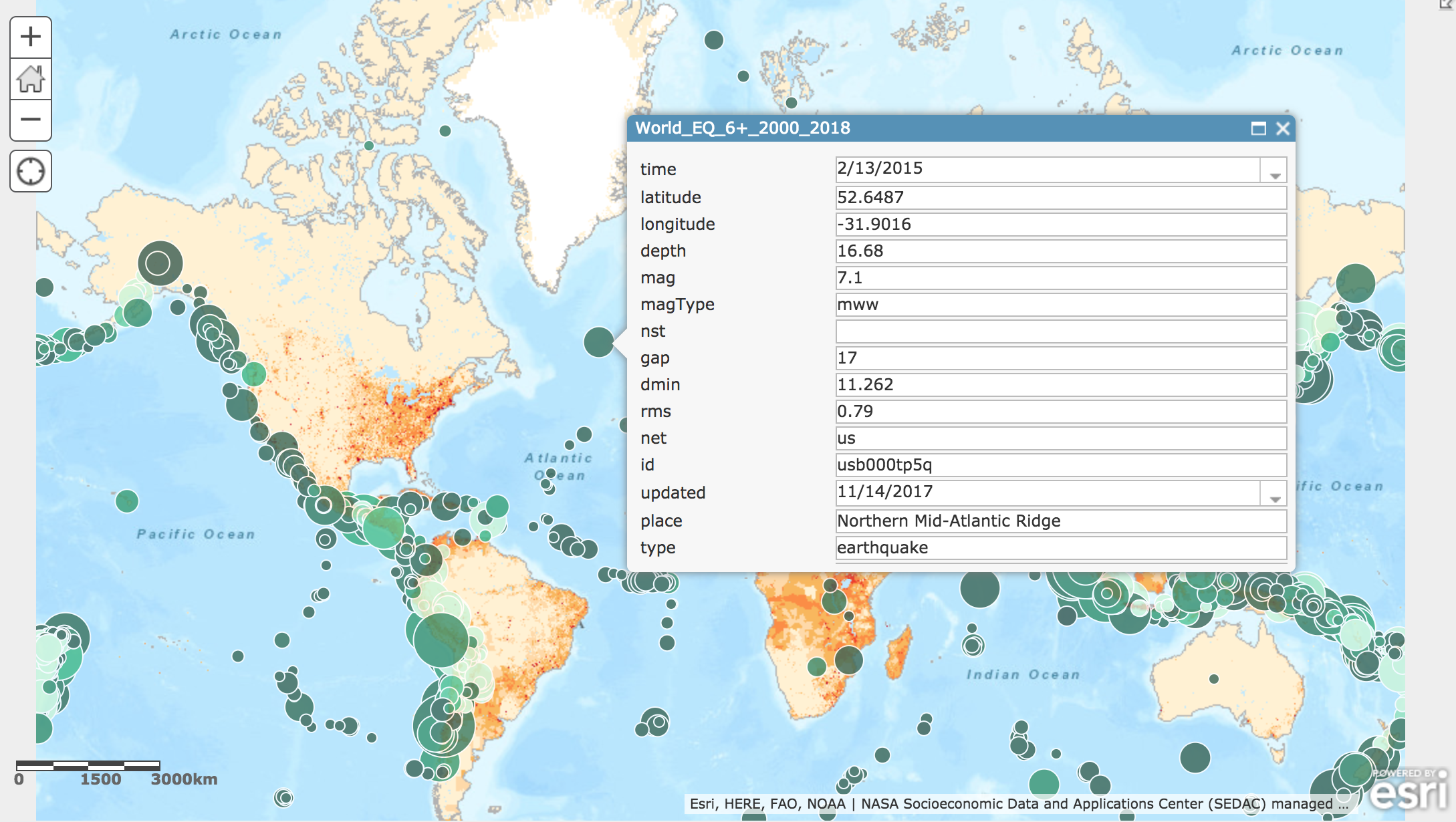
When you play with the map, you will soon find some more useful features, for example, if you click the one earthquake, you will find that all the information in the csv file for this earthquake will be shown in the popup window:
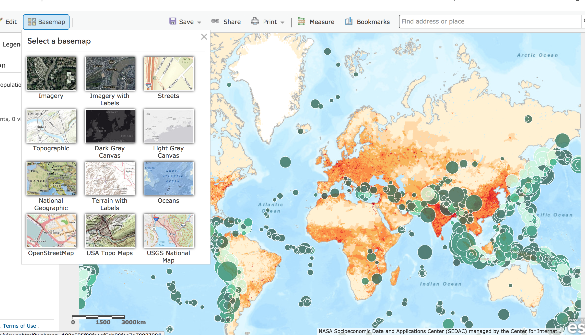
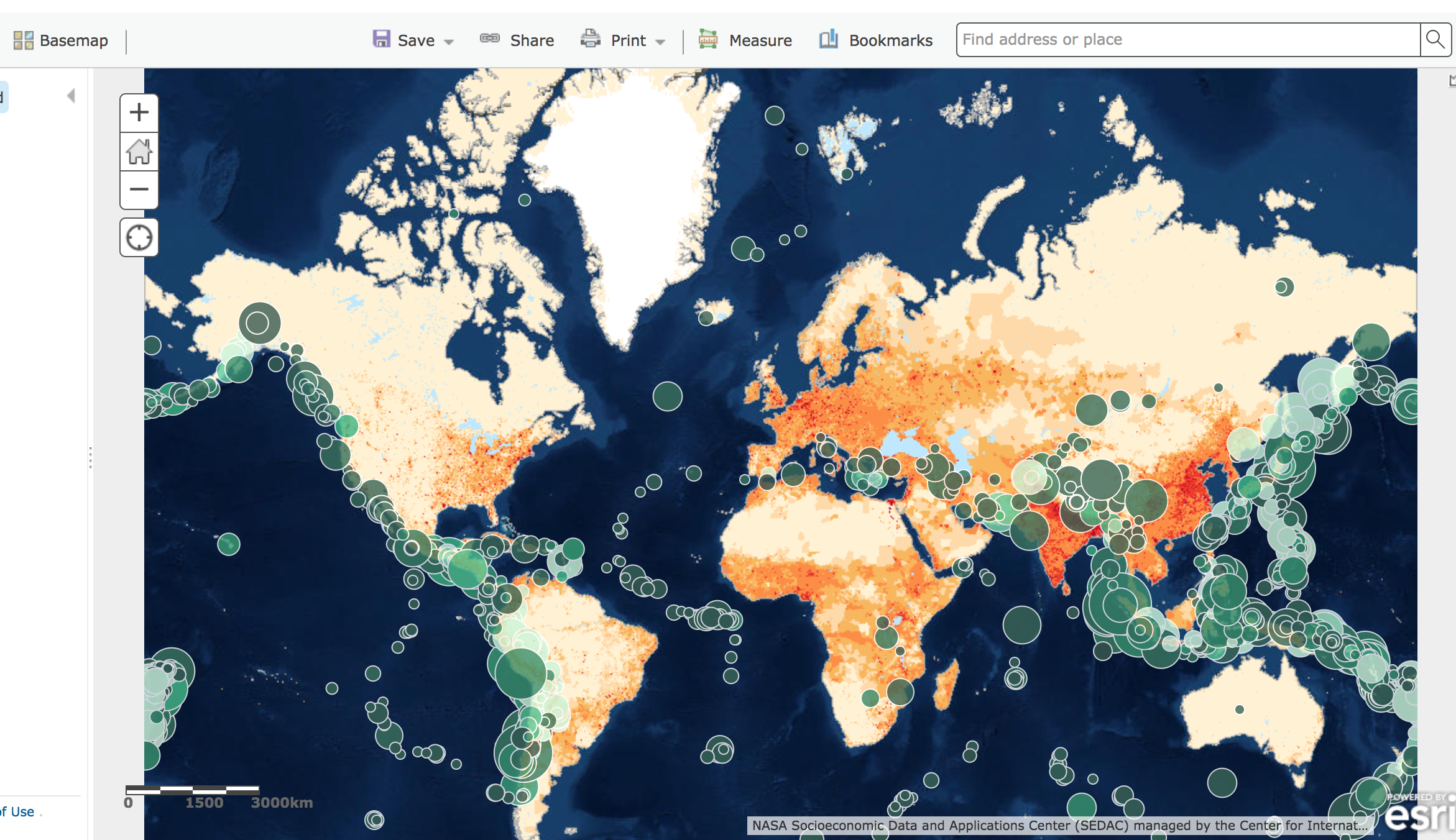
Also, if you don’t like the background map, you can easily change it by choosing different ones from the Basemap:
I hope you find this is useful.